
Mobile "Chat with a Representative"
Project Overview
Problem
The current system implemented had several usability issues that needed resolution. Phase 2 with new features also needed to be designed and developed.This evolved into the creation of a custom system which included implementing two new features after the chat was ended
Solution
A custom system which included implementing two new features after the chat was ended. This custom system took the 3rd party solution as a base, with changes based on design decisions stemming from the user research. After implementation, the annual revenue estimation was projected to be approximately $1Million.
Background
Sears and Kmart mobile were implementing a Customer Service Chat, which included Brand Chats (a system in which the user could communicate with chat representatives for specific brands like LG, or Monster). My original task was monitoring the work that a 3rd party solution was implementing. However, after some usability tests completed regarding the experience brought to light several usability issues, I stepped in to create a custom experience, building upon and improving the 3rd party solution.
This ended up being a great opportunity to also launch our two ‘after chat ends’ action options - ‘Send Transcript’ and ‘Rate Chat’. The design of ‘Rate Chat’ came with its own unique subset of challenges that had to be worked through to create a useful interaction and experience.
Original Experience:

Waiting to connect to a representative

After end of conversation

Closing the conversation

When Chat Bubble is closed
Process
Analyzing results from User Experience Research
The first step was analyzing the user tests with the User Researcher who completed the test. Where were the problem areas? Was it something that we could fix?
5 main usability problems were identified and highlighted through these results.
1) When respondents did not pick up on meaning of chat bubbles, chat became very difficult to use.
2) Members are having problems locating the chat bubble.
3) Members have trouble differentiating between minimizing a chat and exiting a chat, and have trouble successfully closing the chat bubbles
4) Members are not aware that they can move the chat bubble
5) Member login was mistaken for chat
Some of these problems had easy fixes:
Problem 5 was not actually an issue within the experience. Rather, it was a problem getting to the experience. By moving the location of "Begin a Chat" to a more visible place on the screen as well as changing the member login logo (an unrelated project) problem 5 was solved.
Problem 4 was a problem, in part, of problem 2. If users cannot find the chat bubble, then certainly they are not be able to move it. Similarly, Problem 1 also could stem from not being able to locate the chat bubble. However, there also seemed to be confusion over the bubble shape.
With further analysis, these five pain points boiled down to two action items.
Change the ‘chat bubble’ so that a) users are able to locate it when the chat is minimized and b) understand what the bubble was representing.
Better differentiate between minimizing the chat button and ending the chat session.
Problem 1: Change the Chat Bubble
Instead of bubble, a better visual would be a "chat" button that is shaped like a message icon. When the user clicks on this, all open chats will pop up. (*Note: The nature of the project included ‘brand chats’ where the user could communicate with chat representatives for specific brands like LG, or Monster)
The color did not change, which was a point of concern, but changing the shape and label on the chat bubble was enough to alleviate most of the confusion. The color is a part of our brand guide, and it was important to keep that in the experience.


Problem 2: Minimize, End Chat, and Close Chat Bubble
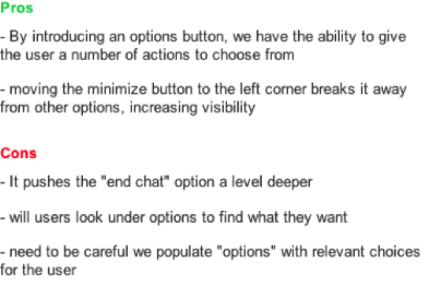
The minimize button was moved over to the left hand side, and a menu button was added. Within this menu button there was room to design paths to end chat, send a transcript and whatever other features that might want to be added to the chat experience in the future. This could be dangerous because it opened up the possibilities to add useless functions that would crowd the user and detract from the main point of the chat, so a caveat for creating that space was that it should be reserved for meaningful additions to the chat experience.

There was discussion as to whether or not to create two separate menus - one the user could interact with while they were chatting with the representative, and one the user could interact with after the chat ended. On one hand, consistency is important in an experience. A user might get confused if the menu changes during the experience. However, I argued for two menus for a couple of reasons. First of all, the menu would be where “Rate Chat” would live. Users shouldn’t be able to rate a chat before the chat representative had the option to help them. Having two separate menus would also give flexibility in the future for various features. We also weren’t taking away functionality, but adding more to the experience so the users would not be missing a feature they wanted to continue to access. Additionally, we weren't taking away functionality, but simply adding to existing functionality. The user wouldn't be missing anything that they wanted back, but rather be gaining options. Ending the chat was a big enough change that the break in consistency would not confuse the users. ‘During Chat’ and ‘After Chat’ could be separated into two defined parts of the experience.

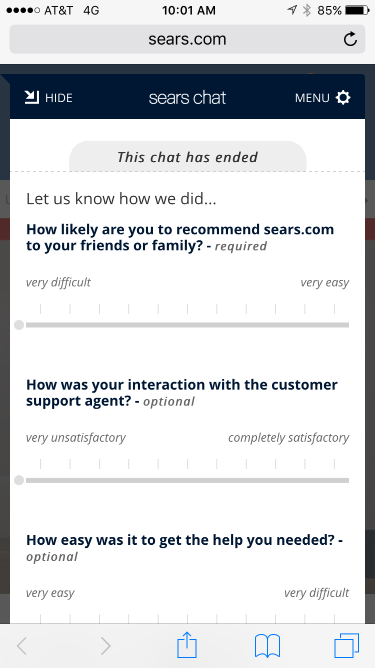
Next was designing the ‘Send Transcript’ and ‘Rate Chat’ functions. ‘Send Transcript’ was straight-forward, but ‘Rate Chat’ ended up needing several revisions. Originally the idea was to have the users rate the chat with a 5 point star rating system. This was a very standard, visual way of rating seen on product reviews, youtube reviews etc.

When presenting this to major stakeholders the 5 point system was vetoed. They wanted an 11 point system, looking something like this:


This was problematic for a couple of reasons. The two-step questionnaire would lose users along the flow. It was important to keep the SUBMIT button above the fold so users would know it was not a long survey. However, that reassurance would be useless if the experience gave the idea that the user would have to go through several pages. Also, the 11 pt. rating system was crowded on mobile. It violates mobile usability standards with its need to crowd the points to fit them on one line. Visually, it is unappealing. With all this in mind I brainstormed another solution.
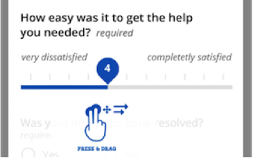
Instead of a radio button design, a sliding scale allows us to fit 11 points on the scale without it looking too crowded, or making it difficult to select the desired point.
The scale included a ‘clean’ state and a ‘dirty’ state to differentiate between which questions the user had answered. When the user selected the button, it changed colors from light to dark and the number the user was hovering over appeared within the button. Further more, the interaction was designed so that when the user clicked on the button it popped off the scale to hover higher than the area the finger was covering. This allows the user to see what value on the scale is selected. The button ‘sticks’ to each integer so the user can clearly tell what value they are selecting.

Further Alterations
Along the way another couple of interaction nuances were corrected.
● Originally the chat window switched from half screen to full screen whether or not the user was responding to the chat representative. This was changed to be full screen for the entirety of the experience so it was smoother for the user.
● After the chat ends the ‘Inactive Menu’ slides up from the bottom of the chat so the user can view their options without needing to take any extra steps.
● After the chat the user can scroll up to view the entire chat, or they can interact with the menu of options.
● The end of experience survey appears open instead of contained in an accordion. This takes a more proactive approach to getting users to interact with the survey and get feedback.
End Result

After End Chat Screen

Loading Symbol

Chat Icon

Active Menu
"Rate This Chat" Survey

Inactive Menu
After the latest chat redesigns were launched, the conversion rate was 2.1%; a 140% increase from before the usability issues found in the research were addressed. This did not include agent and cross session conversions. Revenue from this experience after a month was estimated to be $300k for Sears mobile experience, and $100k for Kmart mobile, with the annual revenue estimation coming to approximately $1Million.